SKETCHBOOK
who doesn't like a fresh start?

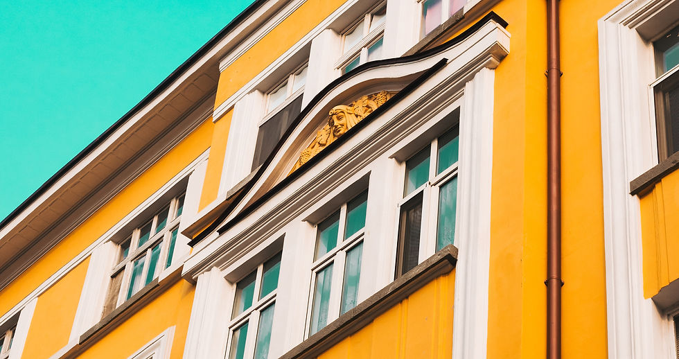
photo example of the opposite of biophilic elements
dark highlighter + blue on blue color scheme
tennis ball = highlighter color + maharam fabric, similar color tone.
I wonder if non-tennis players gravitate to tennis ball yellow/green ?
I think I sketched this, for a client presentation circa 2014. it's always good to show something alive like a green plant or art representing a living growing alive thing when presenting finishes.
you can't go wrong with biophilic elements
people like looking at plants. simply

an oxymoron examination going on here

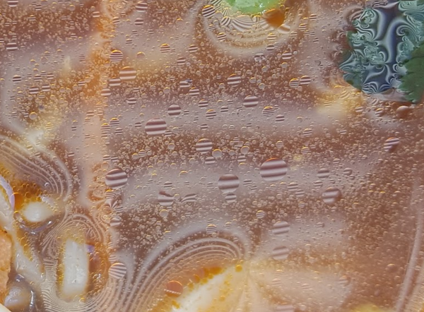
i took this photo of my ramen while having lunch at the Getty Museum in 2017
the ramen was unforgettably tasteless.
and, i don't really love soup, but it was a chilly January day in LA.
it was too hot & by the time it cooled enough to eat, i tasted it and was hungry and disappointed.
but I was intrigued by how the circular specs of oil reflected the abundant linear grid pattern
... with old pics
18 september 2024
oh look, the Getty


AI Gen. Results
19 september 2024